Color affects how we feel and respond in our environment. Understanding the Psychology of Paint in interior design is crucial when remodeling a home, company, or office. Your wall colors will help to create a peaceful haven, a functional workstation, or a pleasant living environment that welcomes interaction. Let’s look at how various tones could accentuate your environment and enhance your mood!
The Role of Color in Interior Design
The discovery about how color affects mood proves truly interesting. Different colors possess the power to lift or relax, and also drive innovative thinking. Use interior paint color selection to align with the room function, as you want to experience emotion in that area.
A bedroom interior design must create an atmosphere of relaxation and calmness. The correct choice of paint for a home office establishment should drive both productivity and focus. Colors produce various emotional reactions among viewers, yet these reactions change according to the lighting conditions.
Natural Light and Color Perception
Human perception of paint colors requires both natural light and color perception abilities. The actual shade of paint becomes visible under daylight, yet artificial lights tend to warm or cool down its appearance. Light brightness determines whether colors appear robust or the environment stays comforting.
Designing Communal Spaces with Color Psychology in Mind
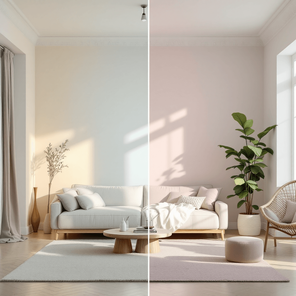
Spaces meant for communal gathering, such as living rooms combined with lobbies, serve as social areas for residents to interact. The use of colors is vital in developing welcoming spaces.
Neutral Tones in Interior Design
Neutral design colours, such as warm greys, beiges, and soft tans, can create an environment of rest. These dull colors are essential design elements, enabling you to switch decor easily throughout the year.
These spaces gain energy through earthy tones, including olive green, terracotta, and warm brown shades. The natural elements of these colors create an outdoor feel inside, but warm coral, together with sunflower yellow, generates energy throughout the space.
Best Paint Colour Combination for Living Room
The best paint effect in living rooms is the combination of a neutral wall base with bold accent colors. Soft beige walls, bold red and teal artwork, and cushion accents will establish both warmth and energy in a space.
Creating Calm in Bedrooms
Your bedroom exists to provide rest to your body. However, a bedroom painted with specific colors can significantly affect sleep quality.
Soothing Bedroom Paint Colors
Pale blue, soft lavender, and light grey are excellent for a relaxing atmosphere. Falling asleep becomes simpler because soothing bedroom paint colors activate the nervous system to become calm. When applied to walls, ceilings, or trims, these peaceful color options will add depth to any room without overwhelming its dimensions.

Paint colors with dark intensity, such as forest green and navy blue, will also create a sense of protection in your bedroom space. Combining these tones creates a relaxing space and performs best with dim lighting and comfortable fabrics.
Boosting Focus in Workspaces
The right paint colours for home offices and professional settings can help enhance productivity.
Best Paint Colors for Home Office
The best paint colors for the home office include clean whites, dusty blues, and sage greens. These saturated vs. muted colors allow for clarity and focus while reducing distractions.
In creative environments, consider introducing energising colours like mustard yellow or coral as accent walls. These colors can inspire innovation, but balancing them with calming shades is essential to avoid overstimulation.
Enhancing Outdoor Areas with the Right Paint Palette
Thoughtful colour choices also benefit outdoor spaces. The correct paint selection creates inviting, comfortable environments for patios, balconies, and gardens.
Best Outdoor Paint Color Combinations
White, cream, and pastel shades operate as reflective elements, protecting boundaries from heat while reflecting light. Your outdoor space can reach a natural appearance when you select the best outdoor paint combinations featuring navy or burnt orange levels to create a connection with nature.
You should choose earthy tones because they are excellent disguisers of dirt and wear, making these colors suitable for common outdoor regions.
Understanding the Characteristics of Color
Personnel must have detailed knowledge of the characteristics of paint when implementing the psychology of paint effectively.
Tone: represents the combination of color with gray because it reduces strength but preserves the original hue.
Shade: represents black mixed with a color, resulting in a deep and moody appearance.
Tint: Combining white elements with a color modifies the appearance towards a lighter, airier atmosphere.
Value: The visual density of a color becomes apparent based on its lightness or darkness.
Saturation: The purposes of color intensity determine the effect on rooms because vibrant hues create energising environments, but subdued hues establish soothing settings.
Space design customisation becomes possible by adjusting the layering of paint colors according to their essential aspects.
Incorporating Seasonal Color Trends
The need for refreshed spaces does not require annual repainting. You can gradually incorporate seasonal colour accents by using foundational neutrals like white, ivory, and grey.
The popular hues for biophilic designs include forest greens and sandy beiges with rust tones. Combining biophilic colours with sky blue or clay creates distinctive areas, which work excellently in boutique hotel lobbies and modern meeting rooms.
Final Thoughts: Designing with Purpose and Paint
The Psychology of Paint in interior design is an essential fundamental force that directly influences our emotions in different spaces. Selecting colors that match the workspace objectives and emotional characteristics leads to improved aesthetics and user experience in the space.
Strategic paint application is crucial in home improvements, workspace design, and hospitality space development to improve complete design results.
FAQs
The Psychology of Paint in Interior Design investigates the impact of colors upon human feelings and conduct in architectural areas. Engineers use this information to develop settings that generate designated emotional responses.
The bedroom requires soothing paint hues, including pale blue, light grey, and lavender. These colors generate relaxation while ensuring better sleeping quality.
Painting a home office with clean white colors, dusty blues, and muted green tones is most beneficial. The selected colors help develop an environment that prevents distractions while keeping focus.
Natural light and color perception methods heavily influence the perception of paint colors. When exposed to daylight, the actual color emerges, yet artificial illuminations modify colors to appear either warm or cool.
Outdoor paint combinations that create the best impression use light creamy tints and pastel colors in combination with intense burnt orange or navy hues to build welcoming spaces with natural character.